
How Narrative Shaped GSS
The challenge
Global Screening Services had spent over two decades doing one thing well: verification with rigour. But the business had evolved. Technology had made its processes faster and more scalable, while the brand still needed to communicate the thoroughness and reliability it had built its reputation on.
The task was to find a narrative that could hold both.
The narrative
We arrived at a simple idea: Nothing unchecked.
A tick usually marks the end of a task. At GSS, you earn the tick only after everything behind it has been checked — every source, record and data point.
This became the organising thought for the brand: technology could make verification faster, but never at the expense of rigour.
From narrative to identity
The narrative gave the visual identity its central device: the tick.
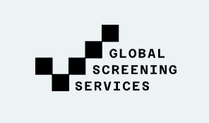
But this wasn't a conventional tick. It was constructed from pixels — bringing together the two sides of GSS. The tick represented thoroughness and completion; the pixels represented the technology enabling GSS to deliver that same rigour faster and at scale.
The idea then extended into the brand's typography and communication system, giving us a language for lines such as:
Until Verified, It’s Just a Claim.
From AWS to a Boutique, We’ve Checked Them All.
Just a Day is Enough for 10 & 10,000.
The website
The same narrative shaped the website copy and content architecture.
Instead of simply listing verification services, we built the story around what GSS makes possible: speed without shortcuts, scale without loss of accuracy, transparency without data captivity.
From “Verification without Data Captivity” to “Correct the First Time, Every Time,” the copy continually returned to the same promise.
Because whether GSS is verifying 10 profiles or 10,000, the principle remains the same:
Nothing unchecked.
(Undertaken as Creative Director at Sane Difference.)
